Flat: The comparison.
This is a side-by-side comparison of the two living spaces.

Old neighborhood. Notice the lack of people on the dead street.
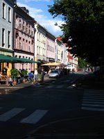
New neighborhood: Lively. Jane Jacobs would be proud.
ROUND: New


Old building. They look like condominiums in Bellevue. The quanza hut structure was the grocery store.

I lived in the room shown here.


New building. This was a retrofit silo that sat vacant for many years. I don’t know what the stored here. It’s in an industrial area. You’d like to think it was some sort of grain, but it could have been chemical, or stores of talcum powder.
Decision: New

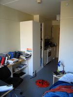
Old digs: The rectangular plan. The narrow entry. The slim “great” room. It was pretty cramped even with the limited amount of stuff I had. Just the way the furniture was, made for not a lot of space.


New Digs: The room is round. Terribly inefficient normally, but they had all the furniture especially mad so that it fits along the wall. And with the amount of stuff I had the space seems gracious.
Verdict: New
Old daylight: The entire wall at the back for the room is window. The daylight here was great.
New daylight: Little. I think because of the structure of the building they could only remove so much material from the exterior walls. This provided for the slime French style doors and that’s it.
Outcome: Old

Old Bathroom: Sufficient, well-organized space. The toilet was sturdy, the showerhead and water pressure solid. There was a shelf for my toiletry bag but nowhere to hang my washcloth or towel.
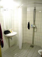
New Bathroom: Expansive. Towel rack. Small hanging caddy set into the wall out of the way and unusable. Nowhere to put my toiletry bag. Shower has a nasty clog and water backs up flooding the whole room. Toilet faces the mirror, like this:

Winner: Tie. I like the space in the new bathroom, but the clog and lack of shelf even this category out. And watching yourself in the mirror while doing your business is awkward and funny at the same time.

Old View: I faced into the complex looking out on this pathway and this building. The people walking and those living in the buildings could look into my place because I could look into theirs so walking around naked with the curtains opened was more of a show then I was comfortable with.

This is what I saw if I leaned out the window.

New View: Vegetation. That’s the trail along the Akerselva. Beyond that, basketball courts.

This is what I can see if I lean out the window.

Bonus: New digs have this lounge on the 17th floor along with a roof terrace


With these views of the city.
Advantage: New
Champion: New Digs. [Crowd goes wild: Ahhhhhhhhhhhhhhhhhh]. All of these facts clearly give the new digs a character and substance to living that the old digs did not have. Coupled with the proximity to the city, and to the architecture school, the new digs are the clear winner. The daylight issue is substantial, especially with the coming dark of winter and went a long way in helping the old digs stay in the game. But in the end a few extra lamps negated the effect. Plus the new digs are round.
In the end the move was well worth it.
Extra:

This is my new hall.

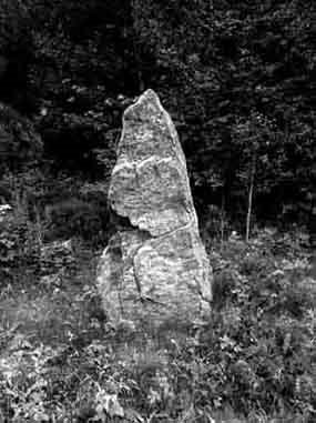
And this, this is awesome. This is the wall that separated the entry, where the kitchen and bathroom are, from the main space. It’s thick [notice the scale hand] and beautiful.
Finally, in Homage to Katie Idziorek weblog, What did the pirate say when... of her trip to Shanghia, I give you, Yellow Awnings. Her weblog is awesome, a lot of photos, little talking. You should check it out.


Old neighborhood. Notice the lack of people on the dead street.

New neighborhood: Lively. Jane Jacobs would be proud.
ROUND: New


Old building. They look like condominiums in Bellevue. The quanza hut structure was the grocery store.

I lived in the room shown here.


New building. This was a retrofit silo that sat vacant for many years. I don’t know what the stored here. It’s in an industrial area. You’d like to think it was some sort of grain, but it could have been chemical, or stores of talcum powder.
Decision: New


Old digs: The rectangular plan. The narrow entry. The slim “great” room. It was pretty cramped even with the limited amount of stuff I had. Just the way the furniture was, made for not a lot of space.


New Digs: The room is round. Terribly inefficient normally, but they had all the furniture especially mad so that it fits along the wall. And with the amount of stuff I had the space seems gracious.
Verdict: New
Old daylight: The entire wall at the back for the room is window. The daylight here was great.
New daylight: Little. I think because of the structure of the building they could only remove so much material from the exterior walls. This provided for the slime French style doors and that’s it.
Outcome: Old

Old Bathroom: Sufficient, well-organized space. The toilet was sturdy, the showerhead and water pressure solid. There was a shelf for my toiletry bag but nowhere to hang my washcloth or towel.

New Bathroom: Expansive. Towel rack. Small hanging caddy set into the wall out of the way and unusable. Nowhere to put my toiletry bag. Shower has a nasty clog and water backs up flooding the whole room. Toilet faces the mirror, like this:

Winner: Tie. I like the space in the new bathroom, but the clog and lack of shelf even this category out. And watching yourself in the mirror while doing your business is awkward and funny at the same time.

Old View: I faced into the complex looking out on this pathway and this building. The people walking and those living in the buildings could look into my place because I could look into theirs so walking around naked with the curtains opened was more of a show then I was comfortable with.

This is what I saw if I leaned out the window.

New View: Vegetation. That’s the trail along the Akerselva. Beyond that, basketball courts.

This is what I can see if I lean out the window.

Bonus: New digs have this lounge on the 17th floor along with a roof terrace


With these views of the city.
Advantage: New
Champion: New Digs. [Crowd goes wild: Ahhhhhhhhhhhhhhhhhh]. All of these facts clearly give the new digs a character and substance to living that the old digs did not have. Coupled with the proximity to the city, and to the architecture school, the new digs are the clear winner. The daylight issue is substantial, especially with the coming dark of winter and went a long way in helping the old digs stay in the game. But in the end a few extra lamps negated the effect. Plus the new digs are round.
In the end the move was well worth it.
Extra:

This is my new hall.

And this, this is awesome. This is the wall that separated the entry, where the kitchen and bathroom are, from the main space. It’s thick [notice the scale hand] and beautiful.
Finally, in Homage to Katie Idziorek weblog, What did the pirate say when... of her trip to Shanghia, I give you, Yellow Awnings. Her weblog is awesome, a lot of photos, little talking. You should check it out.



1 Comments:
awww...i never saw this until now! yay!! :)
Post a Comment
<< Home